
May Art Report (Working Title)
So, May... Yeah. It’s the best. And here’s why: longer days, warmer weather, flowers poking their lovely heads out of the soil, and... snow. Oh, and hail. Hail the size of nuclear grapes. Hail that blisters your truck hood and your Jeep hood because you can’t fit them in your garage for all the camping gear.
That’s the other thing about May: camping. In anticipation of better weather and the opportunity to get into the great outdoors, and with wads of hoarded PTO in hand, we planned a momentous trip to Utah at the end of May, to trek, hike, march, and otherwise traipse through the majestic environs known as Bryce Canyon and Zion.
And we did so. In between nights that dipped into the 30s (Yikes!), we did Fairyland Loop, the Emerald Pools, and the Narrows in temps that leapt into the upper 90s. (We drove back to our campsite one afternoon with the thermometer reading 102 F).

Utah, like May: The. Best. (Well, except for maybe Colorado, Hawaii, Mexico…)
So, art… I’ve been making some and since I usually post something on Facebook offering an sampling of work completed in the past month and, this time, blew that off because, as we quickly learned, there is ZERO (nada, zilch) internet or phone service in the Bryce/Zion dead zone of Utah, I decided to spend an entire blog explaining it. By explaining, I mean, giving a little background info on each piece.
In other words, this should be short. Because, besides May and Utah, here’s the other thing: I don’t think a lot when I make art. That’s the point! It’s an opportunity to take a break from cerebral activities, relax, and enjoy the (sometimes) wonderful marriage of colors, shapes, and composition as they (sometimes) mysteriously merge into a thing of beauty. Not a lot of deep contemplation went into any of these pieces. But they were (mostly) satisfying to create. (See my formal artist’s statement for more.)
Note: A not very fun part of art is naming pieces. Maybe some artists like doing that. I dread it and tend to think of it as a form of torture. Unless something immediately or obviously presents itself, I have to make titles up. And those titles are usually dull as toast. (My wife says that, as a writer, I should be good at it. I’m not.)
Let’s start with the acrylics - my thorn in the side. I really (REALLY) want to be good, or even just better, at acrylics. But that is not yet the case. In the acrylics below, my goal, as always, was a mashup of James Hoyle, Ed Sandoval, and good ole Vincent. Also, not to suck.

I call this one “Tree with Mountain.” Or maybe: “Mountain with Tree.” It could also be “I Wanted It To Be More Orange But Then It Went Sideways.” I haven’t landed on the title yet. What motivated this particular piece was a desire to paint something that wasn’t terrible. The jury is still out.

Next: “Tree with Mountain and House.” Or “That Place Over There.” Or “It Came Out Ok.” I actually kinda like this one.
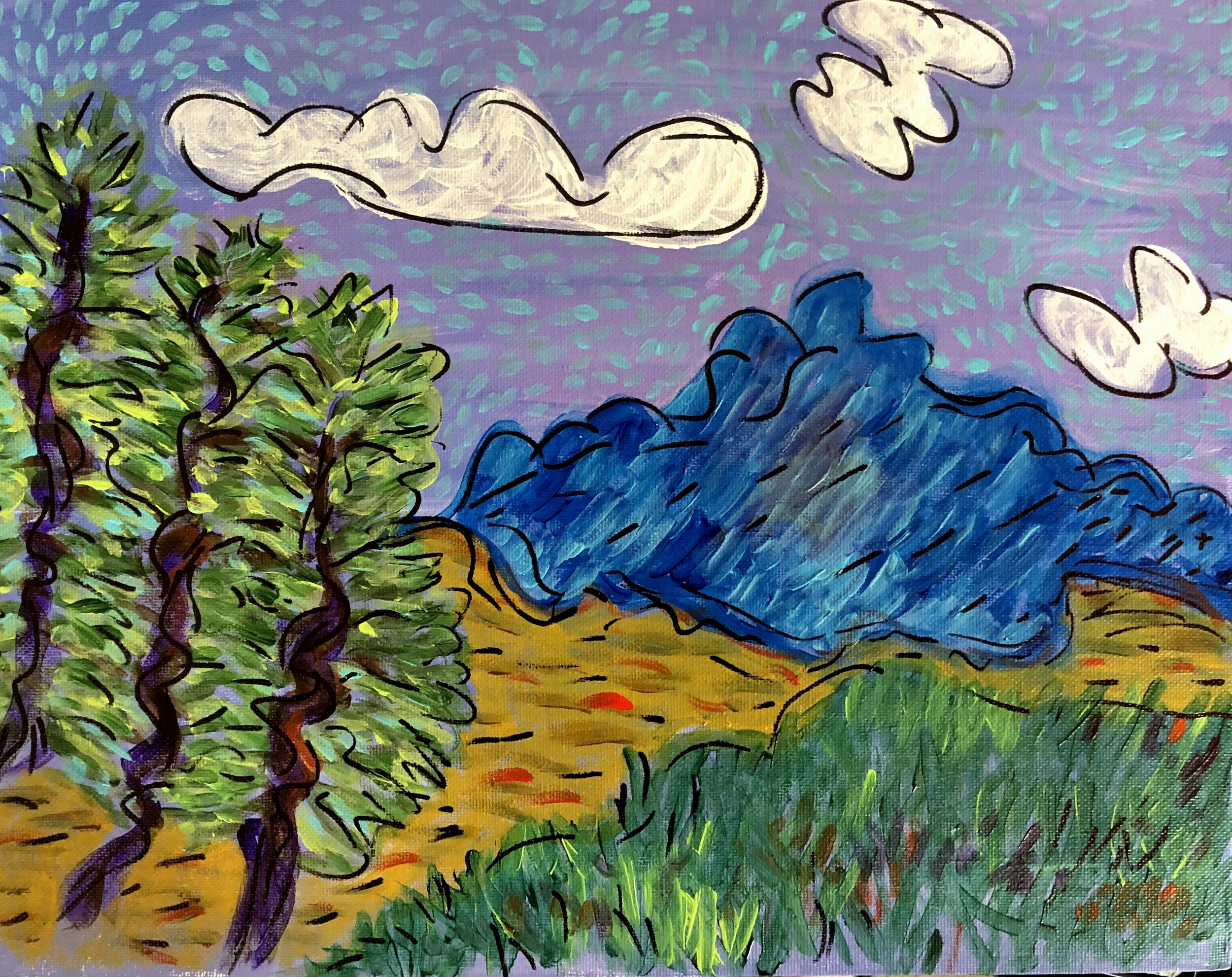
This piece was based on a photo we took on a hike at Mt. Hermon. I’m leaning toward “Three Trees and a Mountain.” Or “The Photo Was Better.” Or “I Like the Trees But the Clouds are Sketchy.” IMO, the sky is a trainwreck.

Now the transition to something I’m much more comfortable with: pastels! Woohoo! Yes, they are a pain in the backside. But I LOVE them! So this one is three palm trees on the beach in Hawaii. I’m pretty certain I’ll be calling it: “Three Palm Trees on the Beach in Hawaii.” But that could change. I’ll let you know. Wish I was there.

Oh, a forgotten acrylic! It started with a palate knife and a thickening solution that made it look 3D. It was interesting. I hated it. So then I painted over it. And then I hated it more. So I painted over it again and... Now I’m definitely feeling it is a visual representation of meh. Working title: Pikes Peak Viewed Through Garden of the Gods and... Yeah... Meh.”

Back to the pastels. Interior apartment with flowers, coffee mug, view of the city. It was motivated by my love for interiors, flowers, coffee mugs, and views of the city. Bet you can guess what I’m thinking of calling it (long title). I like the colors.
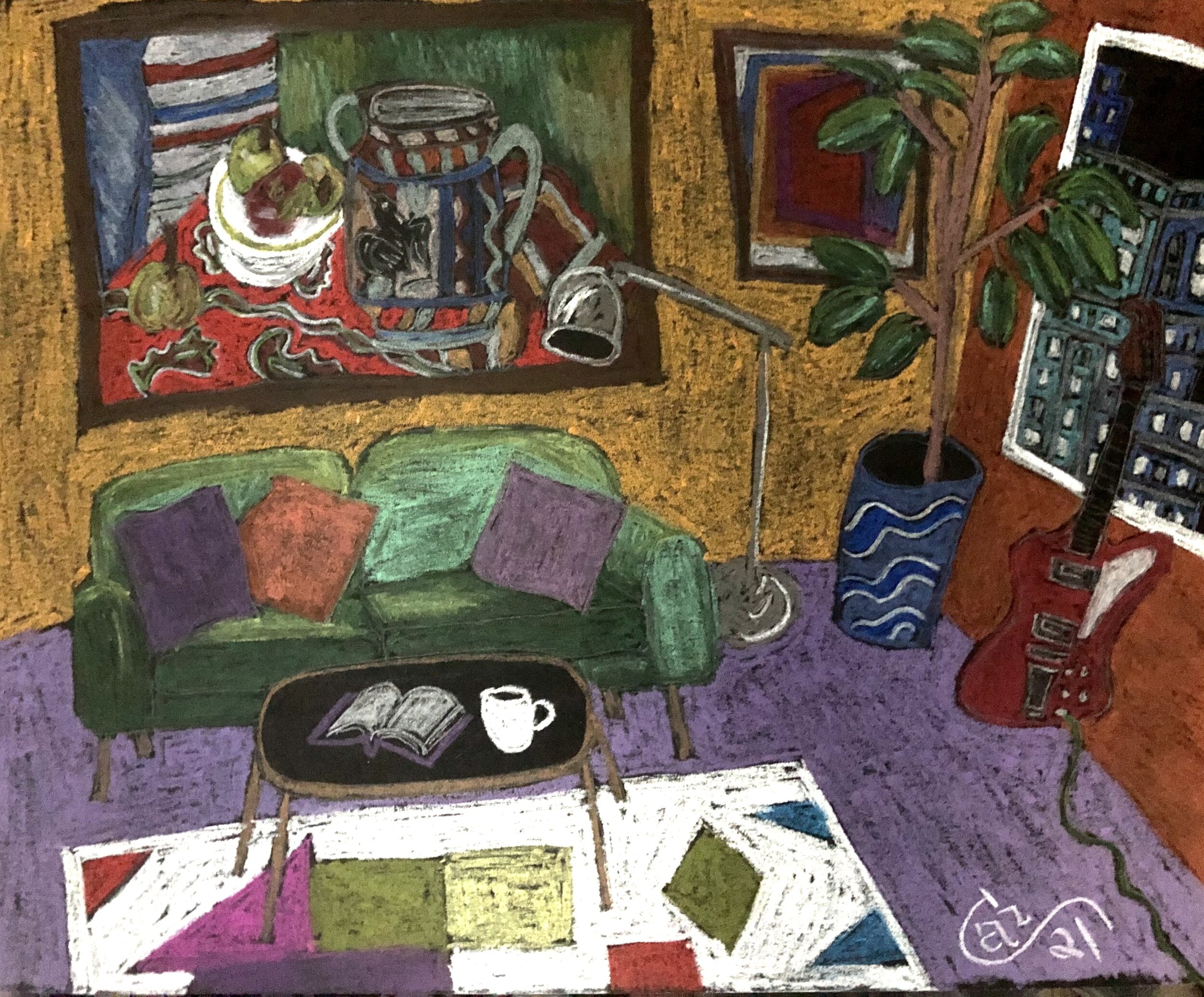
‘Nuther pastel. Woot! Interior, coffee mug, cool pic on the wall, open book, guitar, fav colors. Thinking of calling it: “Woot!”

A quickie landscape of a hoodoo cliffside I did in Utah. Title ideas include: “Utah Landscape,” “Hoodoo Voodoo,” or perhaps “Utah Cliffside Quickie.” Something like that.

Last pastel (there are others, but this is getting kinda long...). Evening in the city. Hey, that would actually be an okay title. Except I think I’ve used that title about 10 or 15 times. Because I like interiors with views of the city in the evening. Why? Probably because of the colors of the sunset, the shapes of furniture, and the fact that I can’t really draw people. Empty rooms are my forte!
And that is the May art report. Now, if you’ll excuse me, I have to sign off. Jeopardy is coming on and while I might not ever make it past the intro test, win a boatload of moolah, and retire to do art full-time, the dream has yet to die.
“What is The Mariana Trench?” Boom! Nailed it!